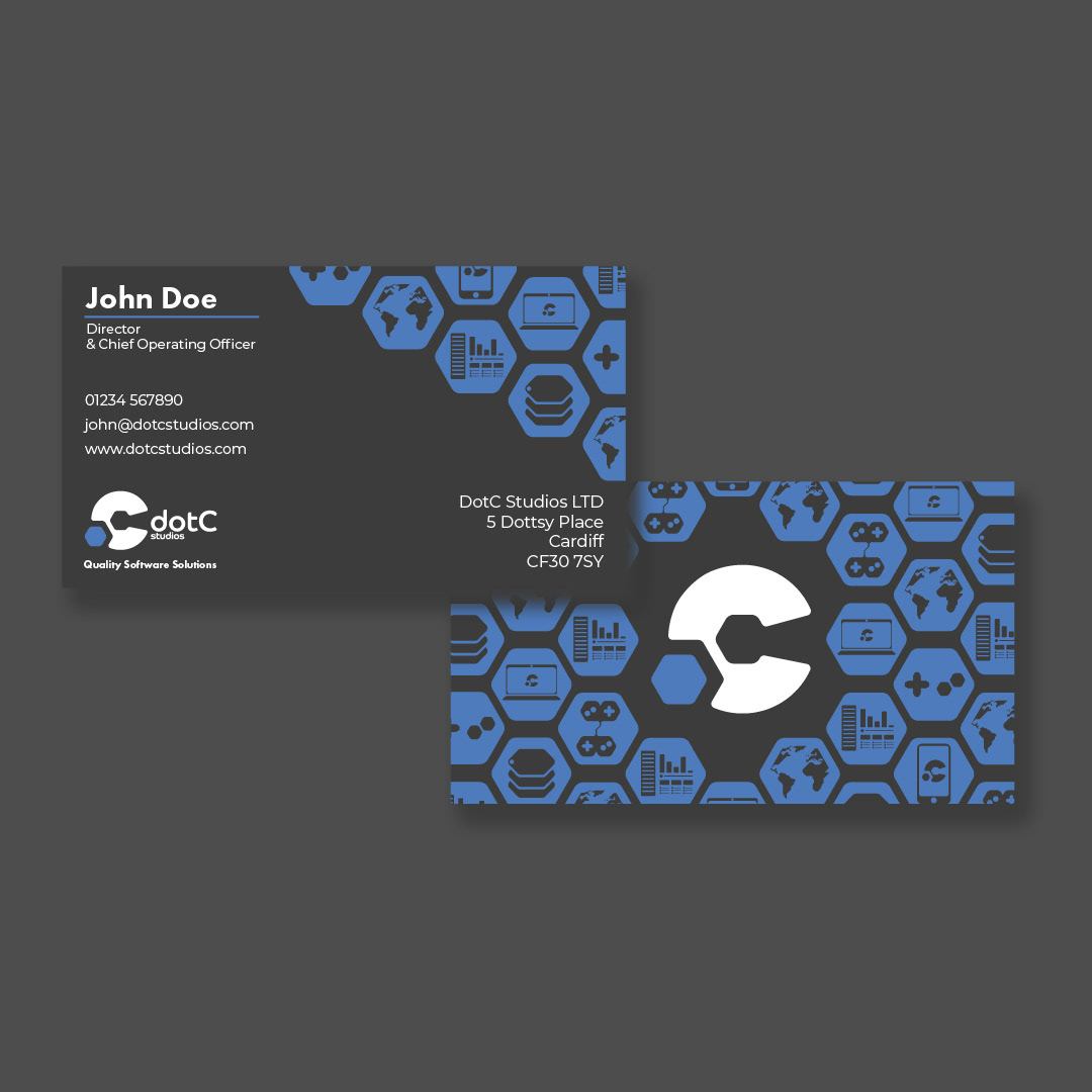

DotC Studios is a brand new website and app development company. They needed a clean, bold brand identity to help cement them as a professional company who really know their stuff.
The logomark is a simple but bold representation of the company's name with a hexagonal dot cut into a large C.
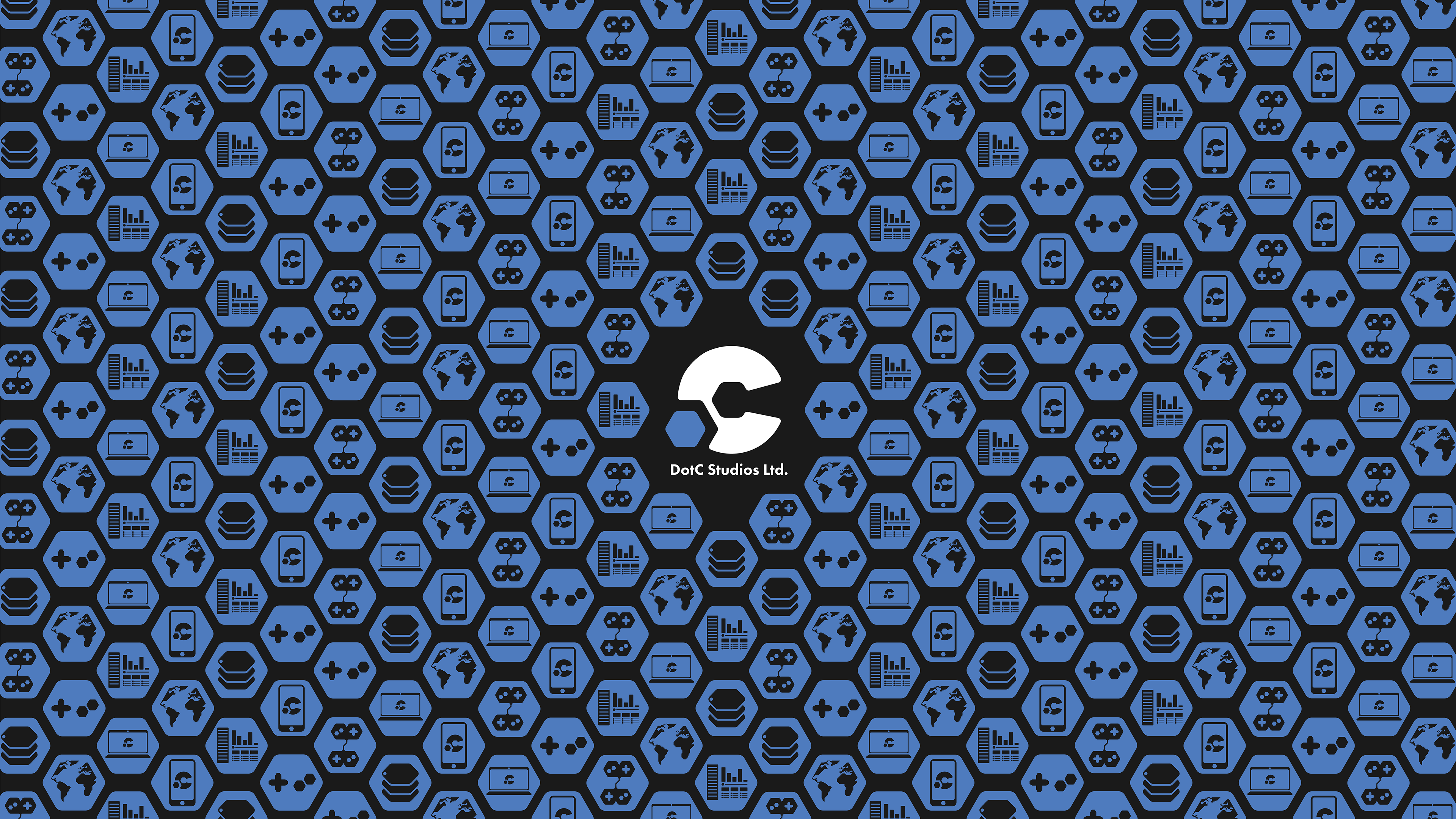
DotC Studios also needed a family of icons to represent the various services they offer. Keeping with the hexagons used in the logo, I created a set of 8 hexagonal icons that could also be used as a pattern across their stationery and social media.